I wanted to do something that is dirt cheap and effective, though I don’t really know where I’m going. But I quickly established the style with heavy depth of field and the use of dynamic lighting.
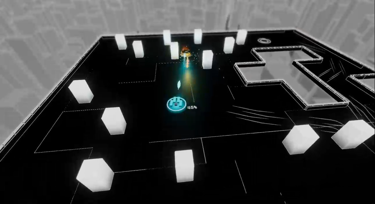
Then I tried an ambient occlusion heavy visual that focuses on color palette swapping. Which almost stayed till the end.
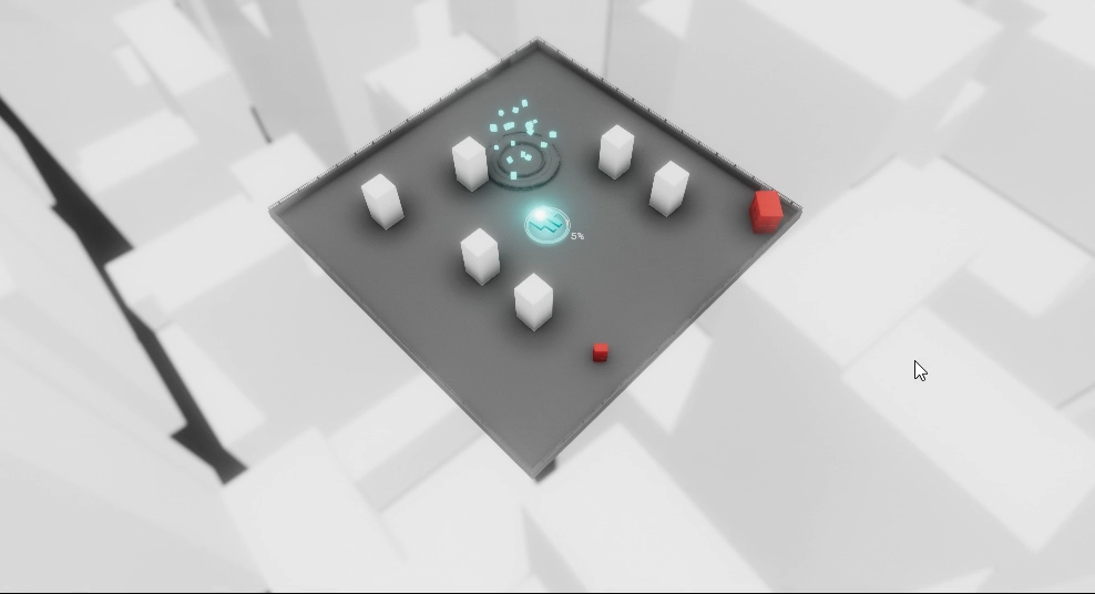
But then the level geometry increased around this time, so I tried my hand at decorating the levels with Unity Particle System. Which I still think looks pretty rad.
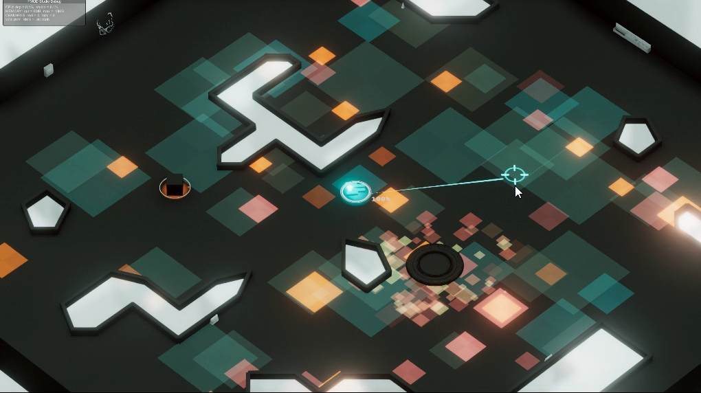
Early combat visual also features tons of particles.
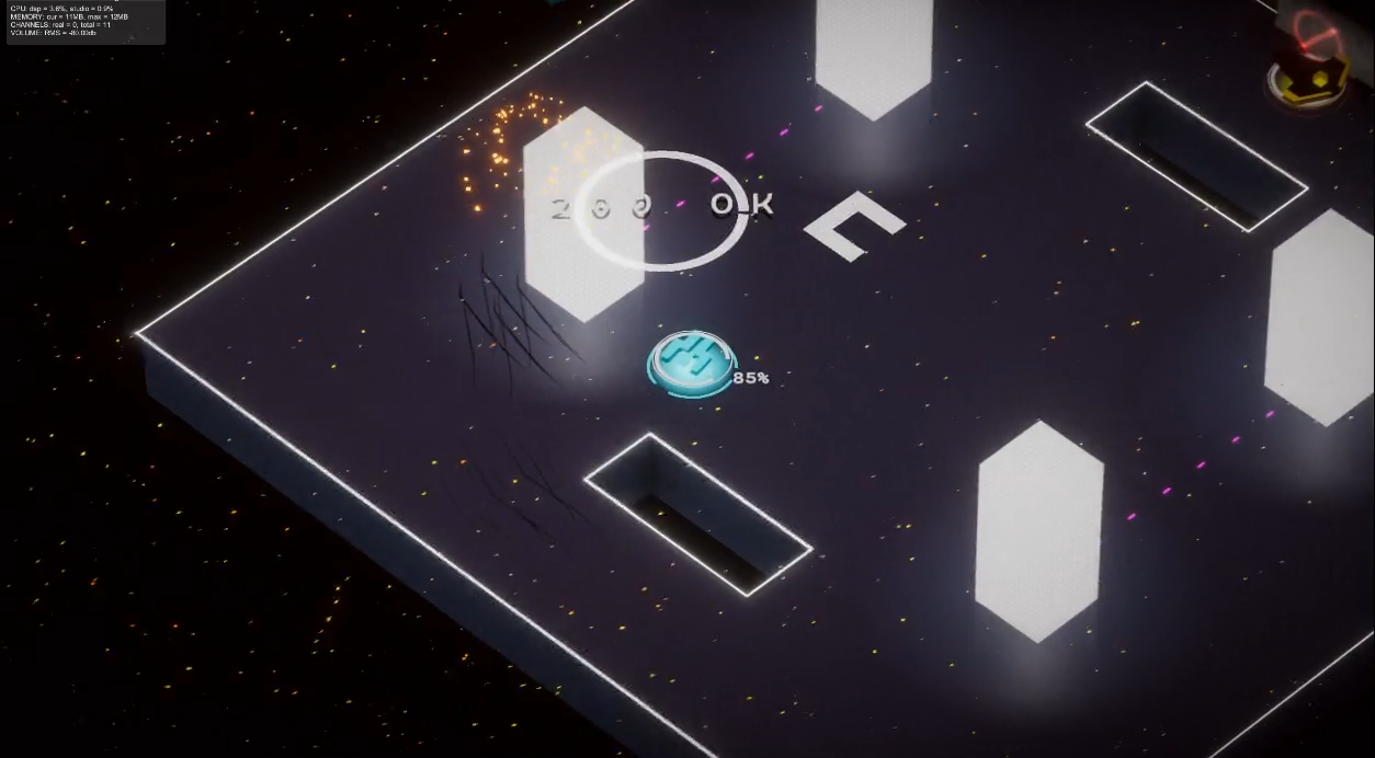
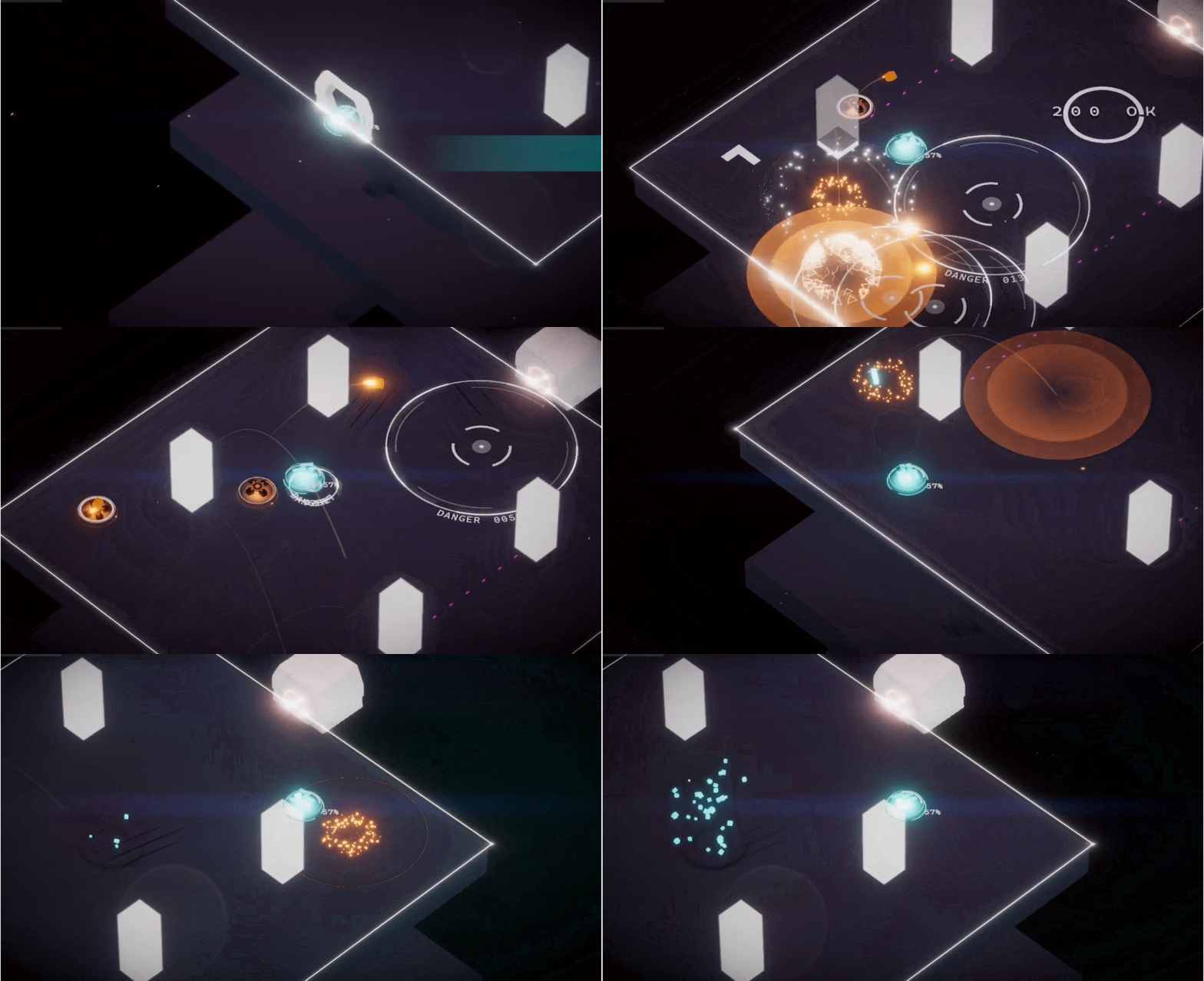
However as I slowing move towards a much simple visual choice with most of the visual stuff done with primitives using Shapes, I began to tone down the visual density again.
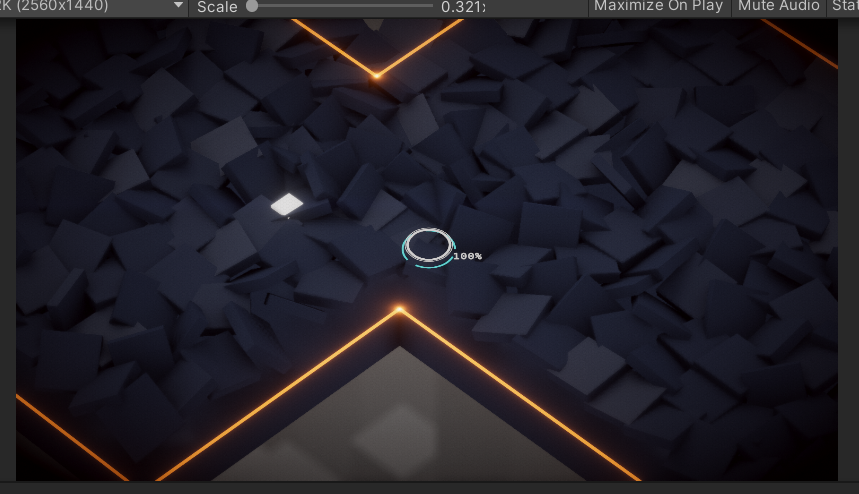
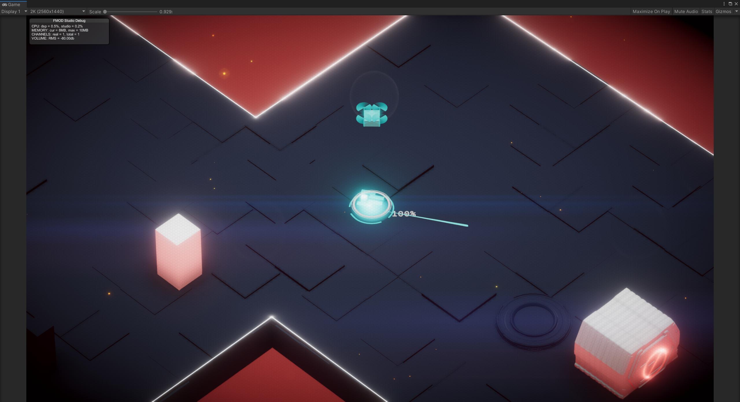
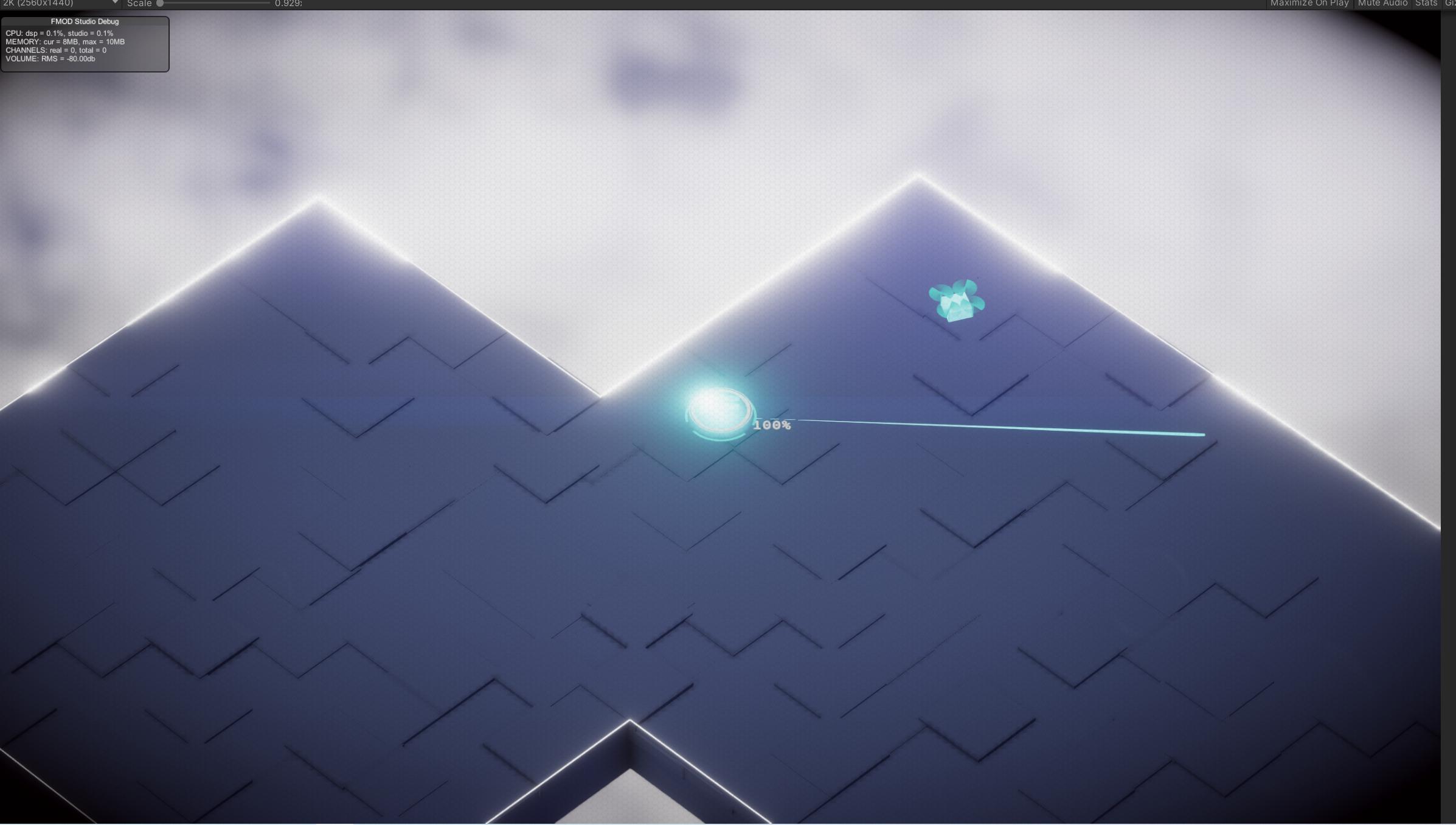
Since I’m not hitting any jackpot, I decided to work on something else before revisiting visual design.
But this initial attempt solidifies several thoughts:
- Dynamic elements is much effective than geometry density, such as dynamic light source
- Since I’m incapable of creating any effective model, I should resort to only primitives
- Color palette can be effective enough in delivering a vibe