Time for yet another quick update on the project.
I’m still trying to figure out how to properly redesign the combat, this part will mostly come down to how fast I can find inspiration for designing meaningfully varied weaponry. In the meantime I decided to mess with more minor stuffs.
Rim indication Effect 🔗
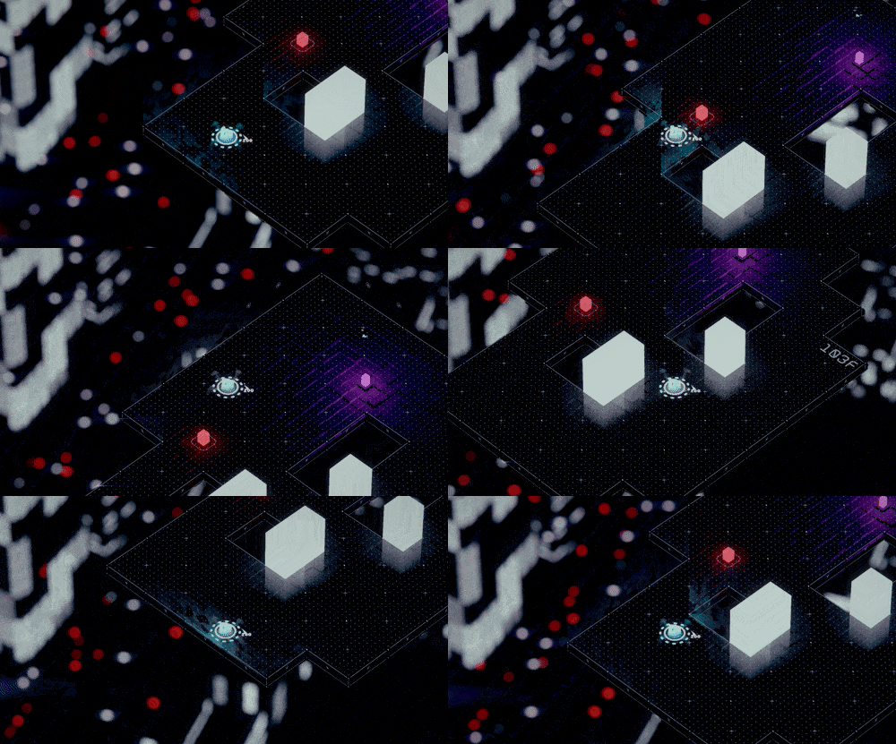
I’ve alway been wanting to do something like this, a gentle indication to show justification for not being able to fall off the platform. Similar stuffs have been attempted before but the visual never feels proper enough, but this time is different, because I’ve finally obtain the power of shader.
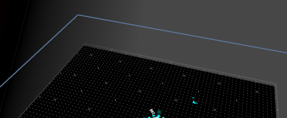
This time around I simply added a quad to all the rim. I have a LevelManager that updates player location and feeds into global shader keyword each frame, then to read it out in the shader and update the alpha of quads accordingly. Other than that, I use the combination of world space XZ and UV’s V to read from a 3D Voronoi Noise to ensure the continuity between quads without the need to actually build a full continuous rim quad.
Why the combination of world space XZ and UV’s V instead of just world space XYZ though? It’s because I wanted to do the usual fake reflection. With world space XYZ, there will be a problem that I cannot automatically know how to calculate the opposite of y difference, so simply use UV’s V then to flip the underlying quads would be much easier.
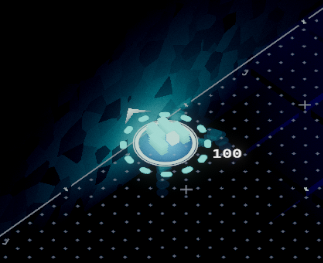
Shadow Casting Light 🔗
Not much going here, basically enable shadow casting and setup some mesh renderers to only cast shadows.
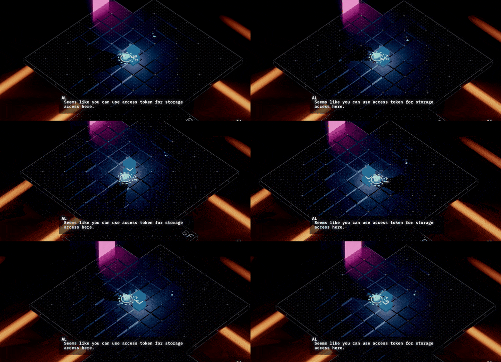
But I ran into some weird behavior with the spot light. My game is physically huge, and the gameplay space will extends to around 40,000 in y axis, which causes spot light shadows to flicker in and out of existence when the height is too high. This is most certainly an issue of precision, but I have zero idea as to why spot light behave differently to point light (which doesn’t have this problem).
So anyways I decided to just change all spot lights to point lights since it still look appropriate and call it a day.
Damage Number 🔗
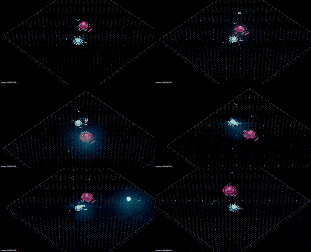
This one is a bit controversial imo, but I think implementing damage number display is still for the better.
My original justification for not implementing it is because I feel like the damage numbers will be break my minimalist visual. But after attempting to implement it, I feel like the existence of damage number does indeed make determining combat effectiveness much easier. So I guess it’s here to stay but with option to turn it off.
Audio Caption 🔗
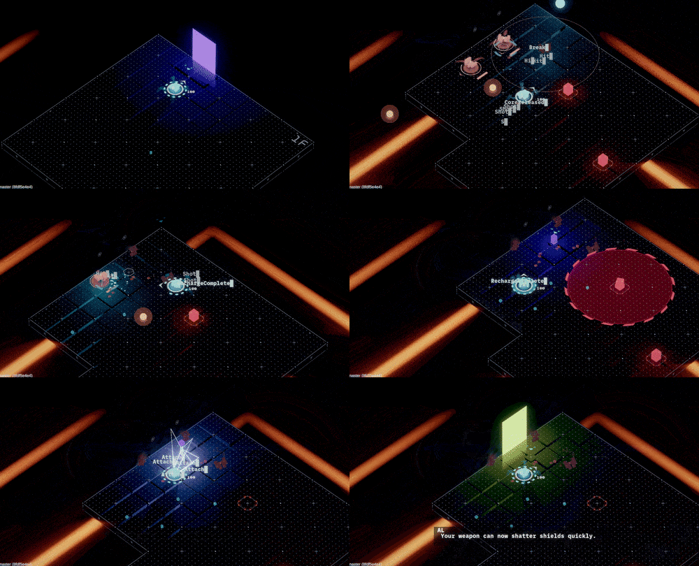
This one is perhaps a happy accident.
I had this setup to help me debug my sfx trigger, but I just realized that, since the rise of accessibility, audio caption seems to be one of the most requested accessibility feature. So I figure that, albeit a bit messy, this is probably serviceable enough for a accessibility feature for those who need it.
I did some extra processing to make sure the effect don’t just become a visual mess:
- Sound effects are renamed to make more sense.
- Sound effects are assigned with an importance value, so that less important sfx will have lower opacity.
And, that’s it.